
Recently discovered the Guardian data blog thanks to Joe Gilmore's help on the current brief.
The Guardian data blog is a dedicated resource for data and visual information. There are a few examples which I could see working in my publication.
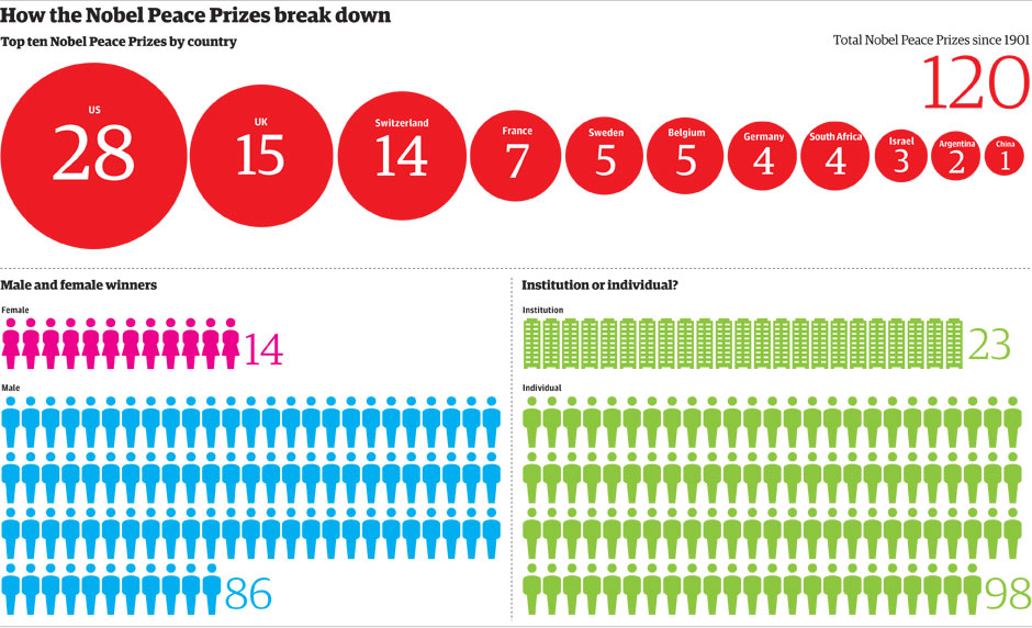
I won't go into what all of these mean but I love the simplicity of delivery particularly the example on Global Emissions. I intend to use minimal colour and clinical typographic delivery so these examples fit perfectly with what I want to do with the brief. The use of simple geometric shapes is something I rely on for image purposes as I don't illustrate anything myself anymore.


0 comments:
Post a Comment